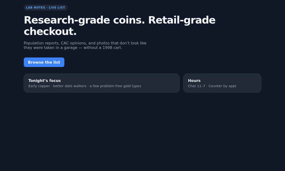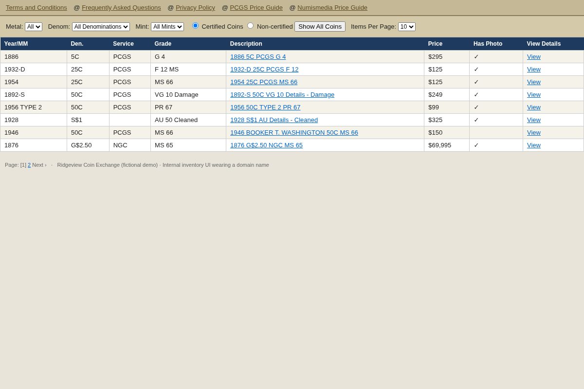
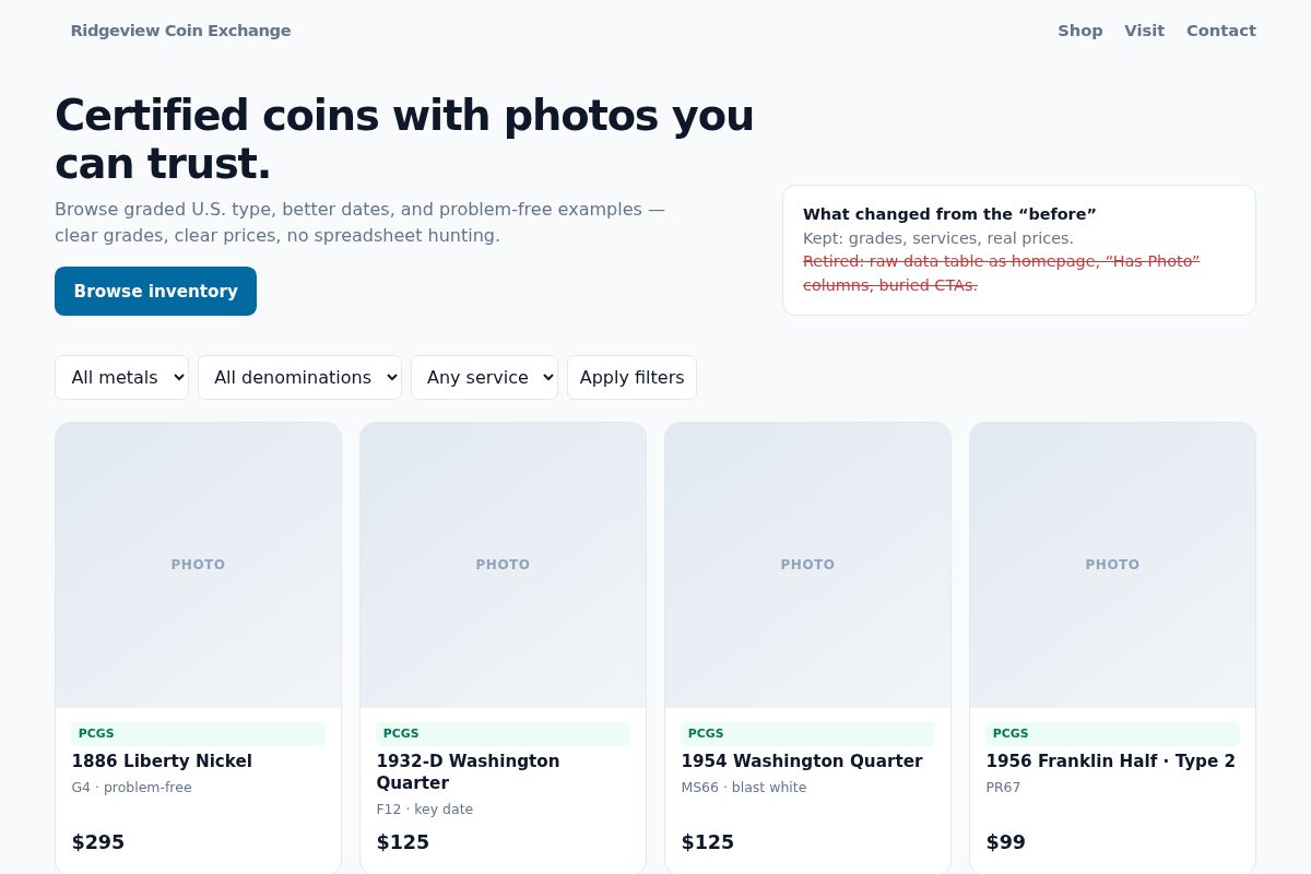
 Before
After · Modern
Before
After · Modern
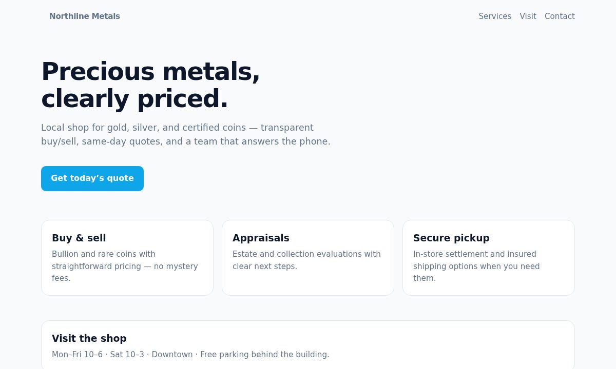
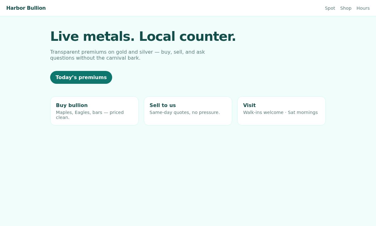
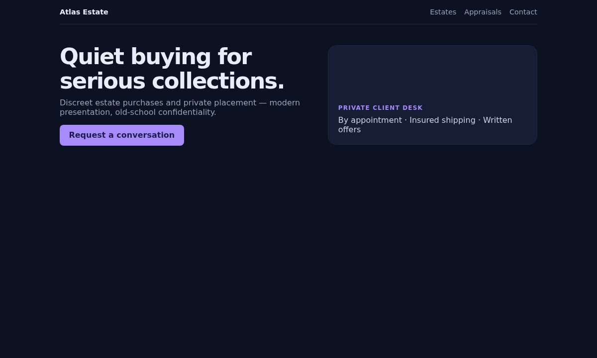
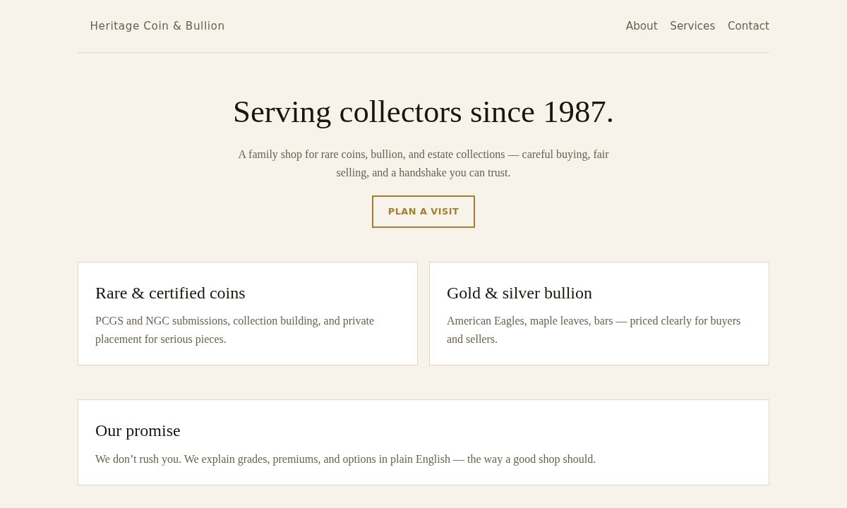
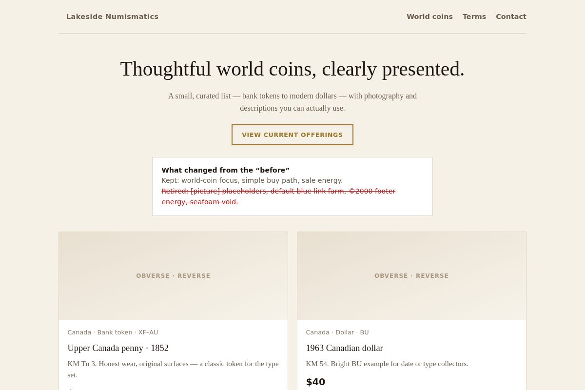
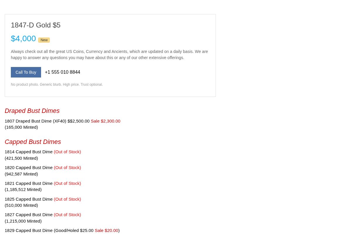
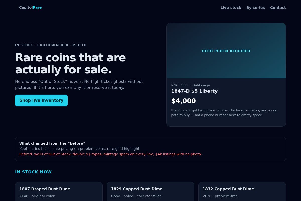
Drag the handle across each pair. Use Open full compare for live pages side by side. Directions below explain Modern / Classic / Techy without a template carousel.
Fictional shops. Real industry mess patterns.
Before
After · Modern
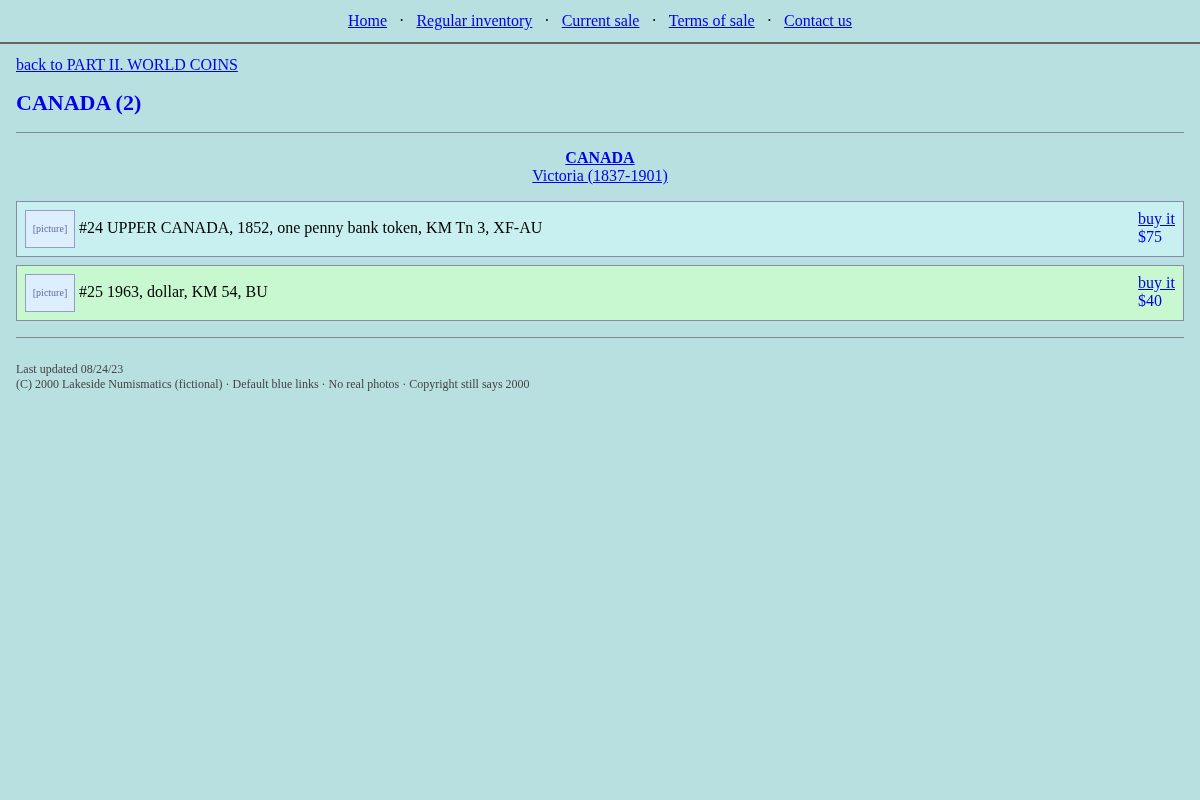
 Before
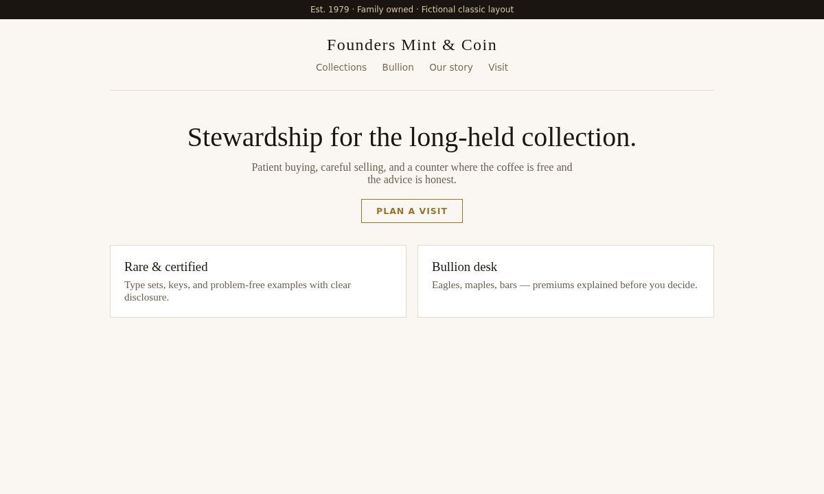
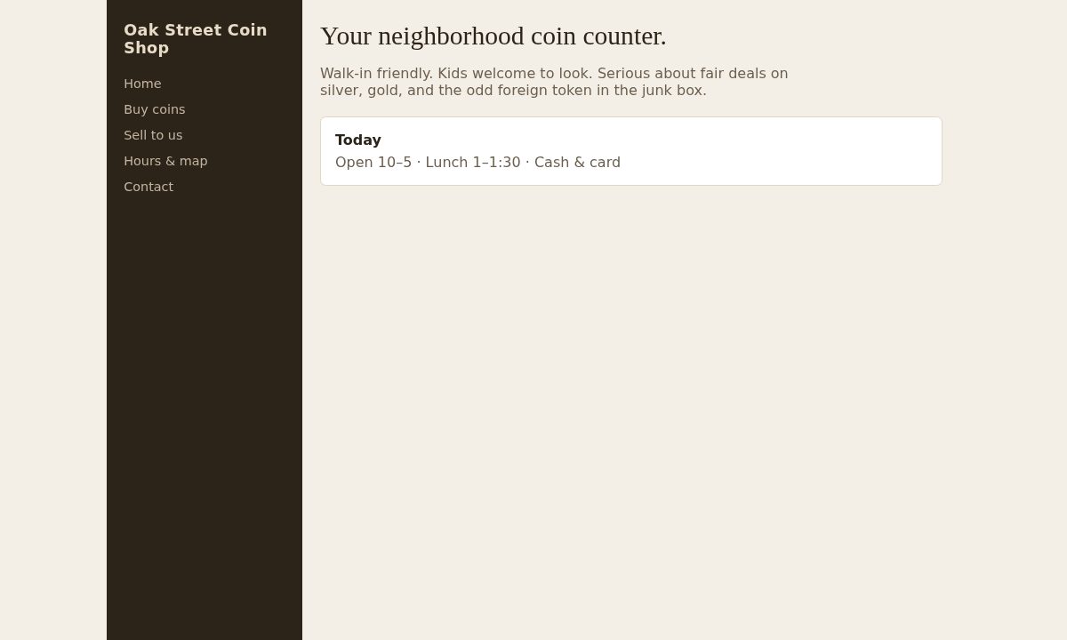
After · Classic
Before
After · Classic
 Before
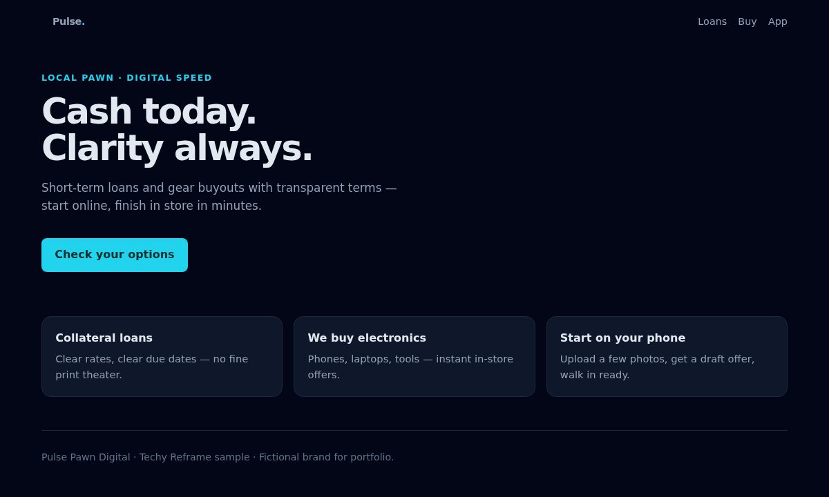
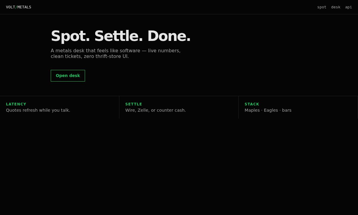
After · Techy
Before
After · Techy
Nine complete sites across Modern, Classic, and Techy — different industries, page counts, maps, and contact pages. Open any of them in a new window.
Modern, Classic, and Techy are design moods — not fixed page skeletons. Your pages, photos, and offers stay yours; each build invents its own layout. Two Modern jobs should never look like twins. The mosaics show different fictional projects inside each direction.
Clean, open, and calm. Big type, breathing room, photos that lead.
Fits: most shops, service businesses, simple and sharp
Warm trust. Feels established — heritage without looking dusty.
Fits: multi-generation shops, high-trust trades
Bold contrast and product energy — online-native, not corporate beige.
Fits: younger brands, digital-first desks, edge without chaos